Matplotlib#
Data Visualization#
It is said that a picture is worth a 1000 words
In technical communication, a good figure is worth a 1000 words
Minard’s map of Napoleon’s Russian campaign of 1812 is often described as the best graphic ever produced
Includes information of the troop size, location, temperature, travel direction and time
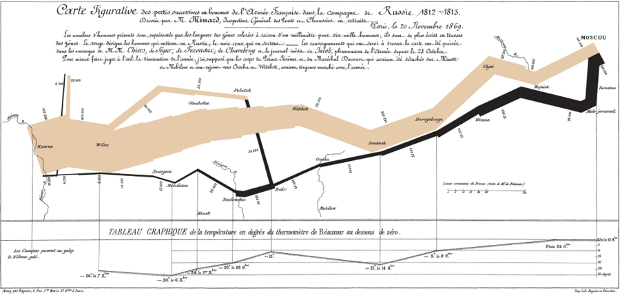
Minard's map
Source:
Wikimedia
Matplotlib#
Matplotlib is a data visualization library built on numpy and designed to work seamlessly with scipy
Originally, it was intended as an interface for Matlab-style plotting in Python notebooks
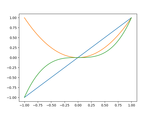
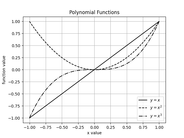
2D plotting
Point data - function in one variable, \(y = f(x)\)
Line plots, scatter plots, etc.
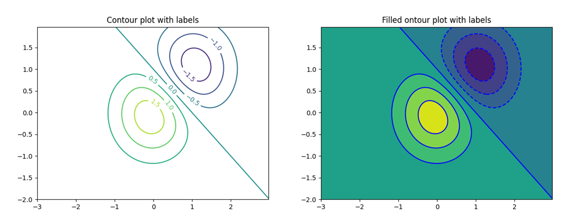
Scalar fields – functions in two variables, \(z = f(x, y)\)
Contour plots, images
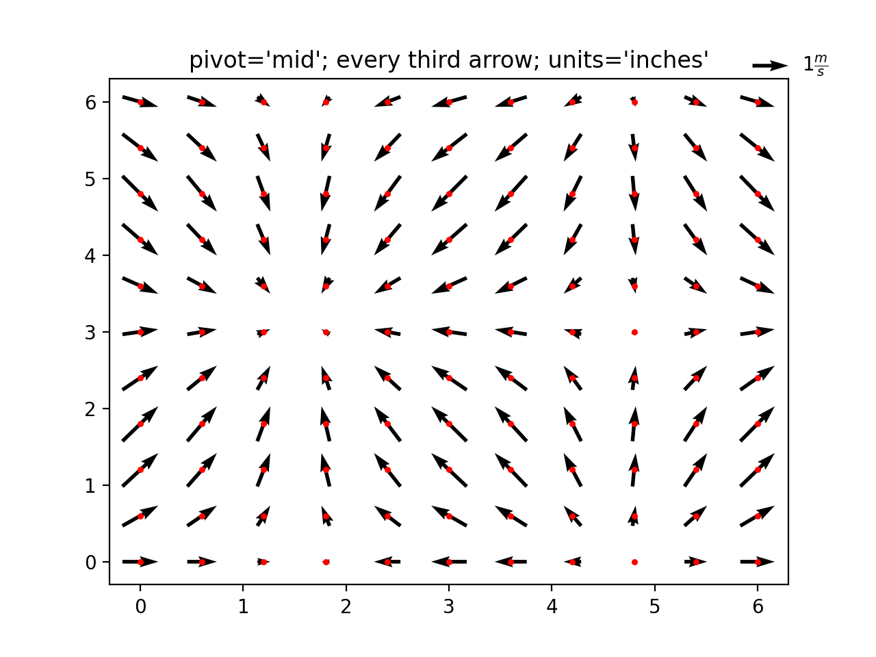
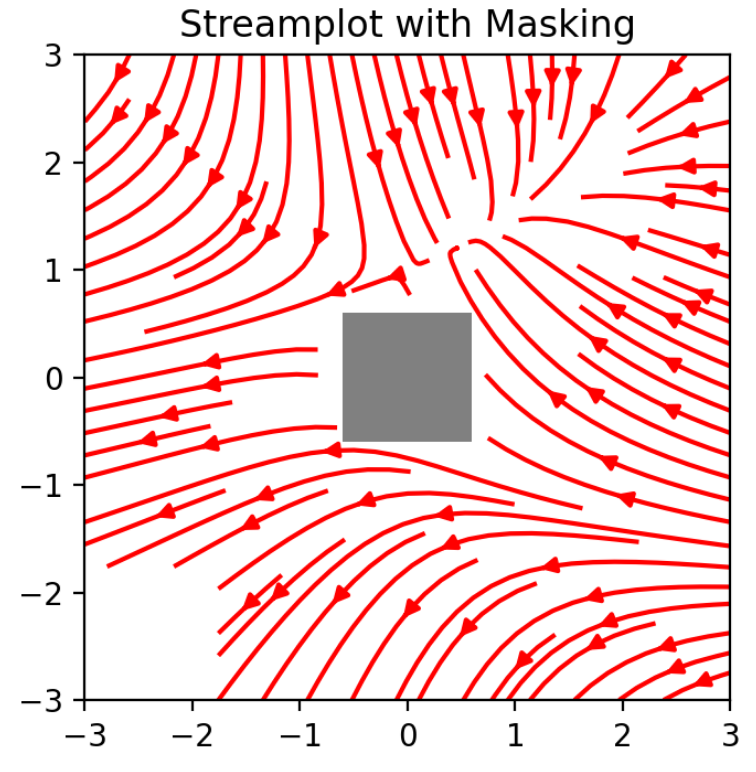
Vector fields – vector functions \(\bar{V}(x, y) = (u(x, y), v(x, y))\)
Quiver plots, stream plots, etc.
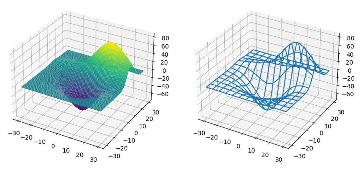
3D plotting - 3D counterparts of point data, scalar fields, vector fields
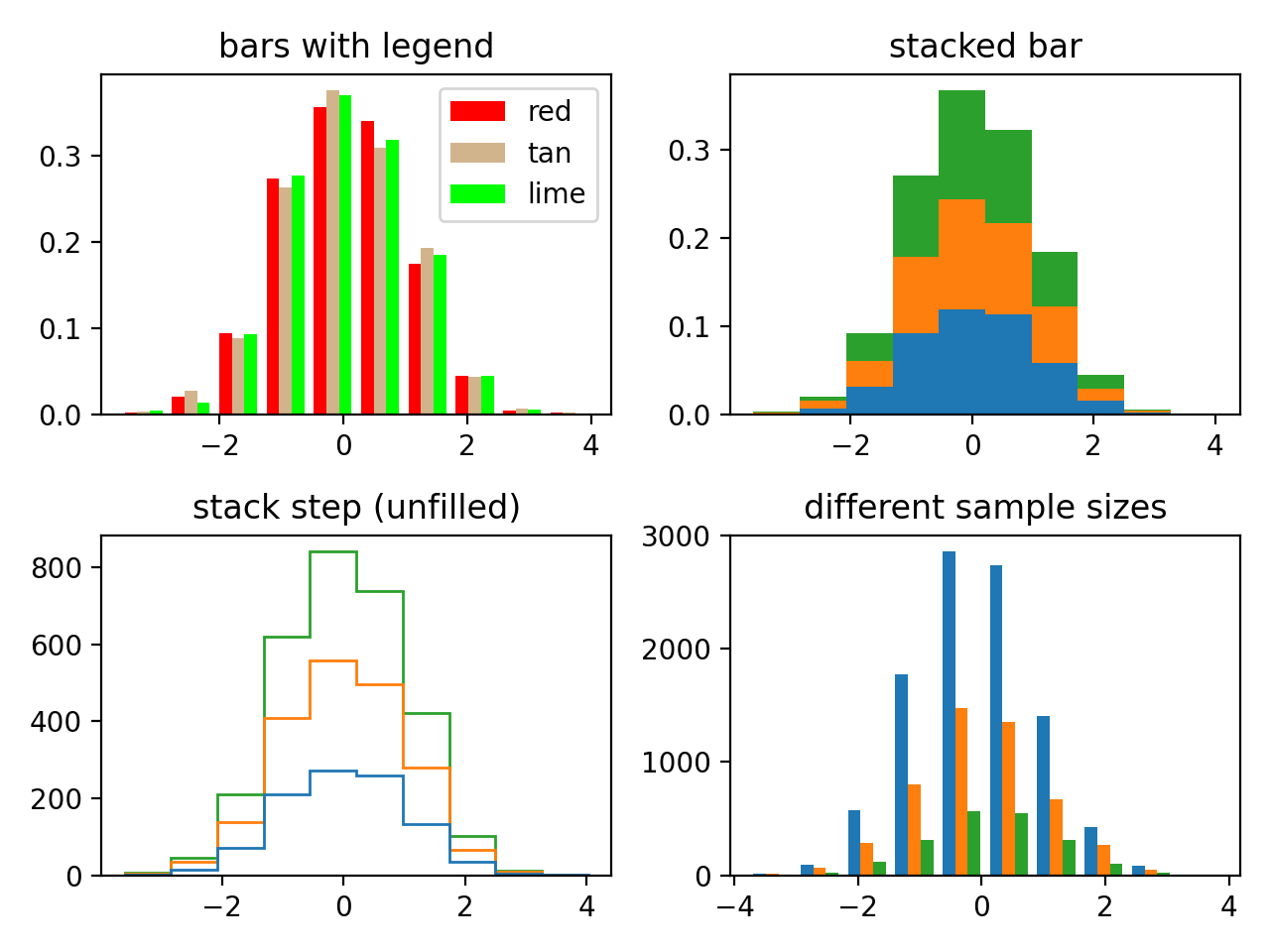
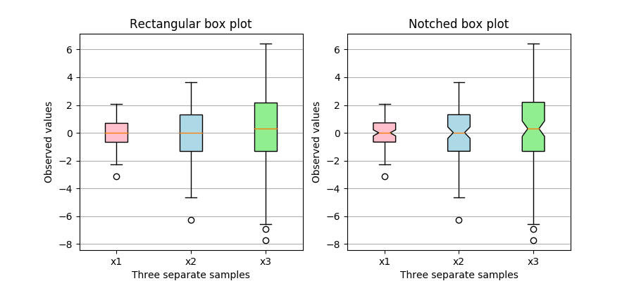
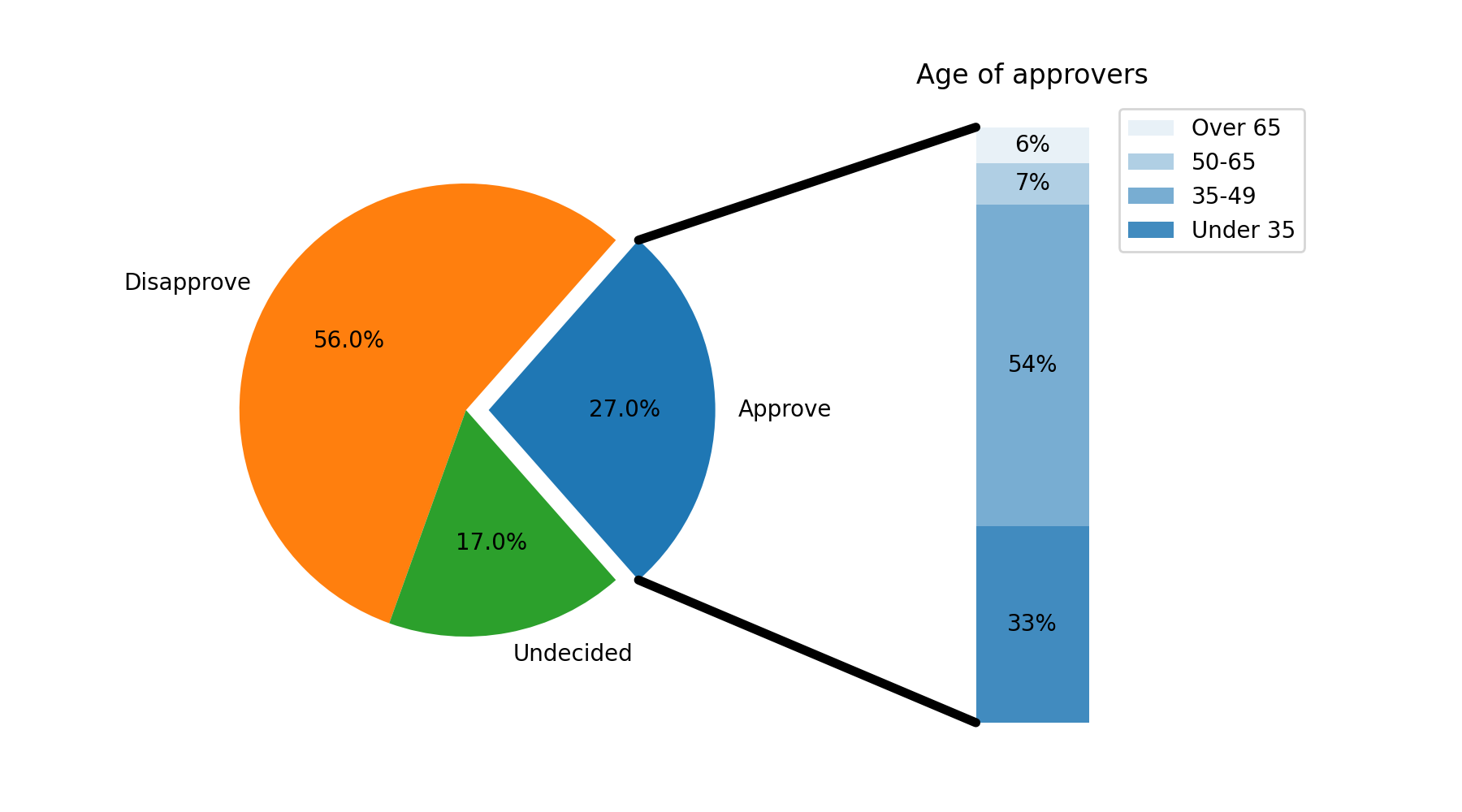
Statistical plots - Histograms, box plots, violin plots, pie charts, etc.
Anatomy of a Figure#
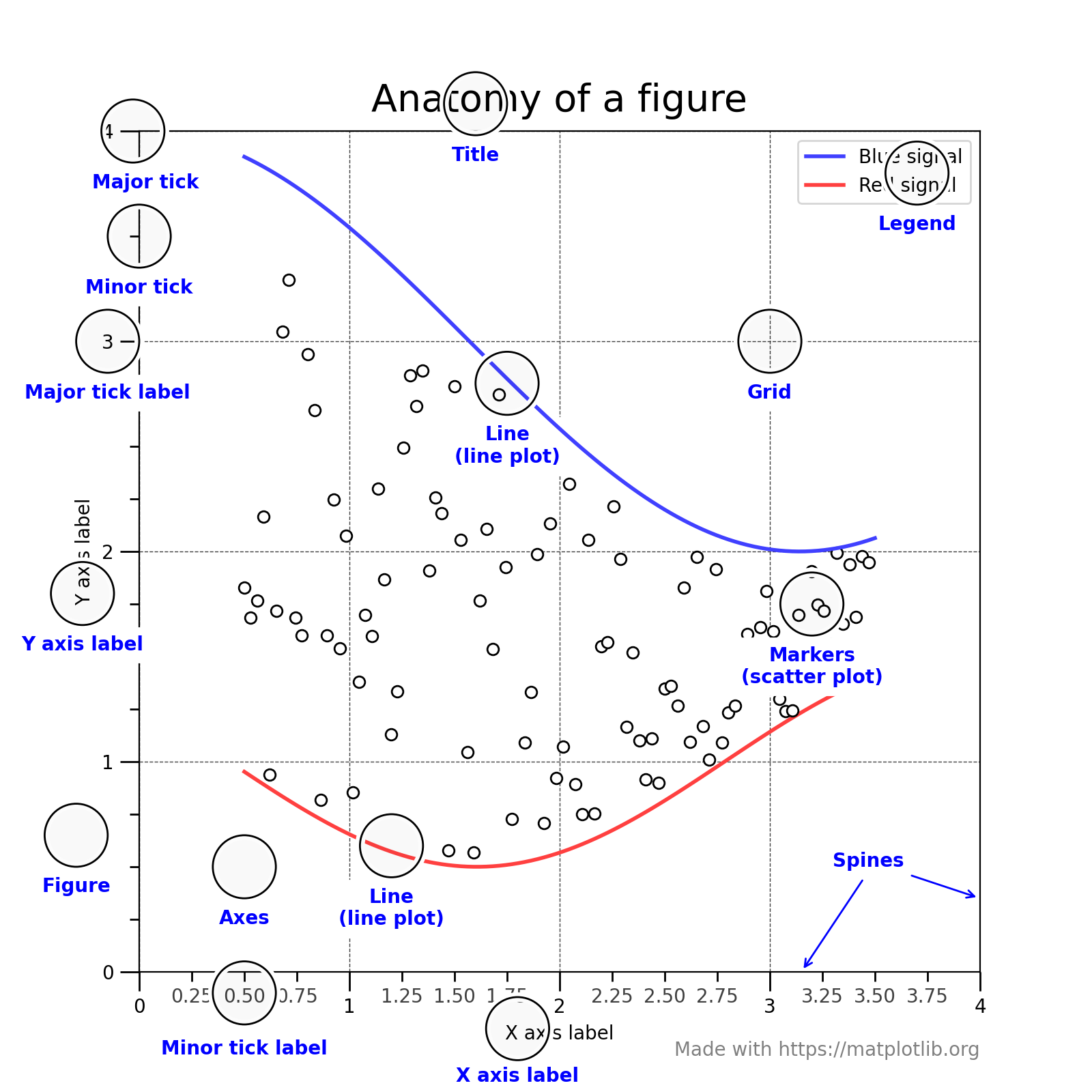
Source: matplotlib.org
All matplotlib plots have three main elements
A Figure object
The main canvas or stage
All the other figure elements are artists that act to create the final graphic
Axis objects (x, y, z axes)
Control the limits of the plots
Contains the ticks and tick labels
Axes objects
The actual data to be visualized
…
Matplotlib Examples#
See https://matplotlib.org/stable/gallery/index.html for more examples
-
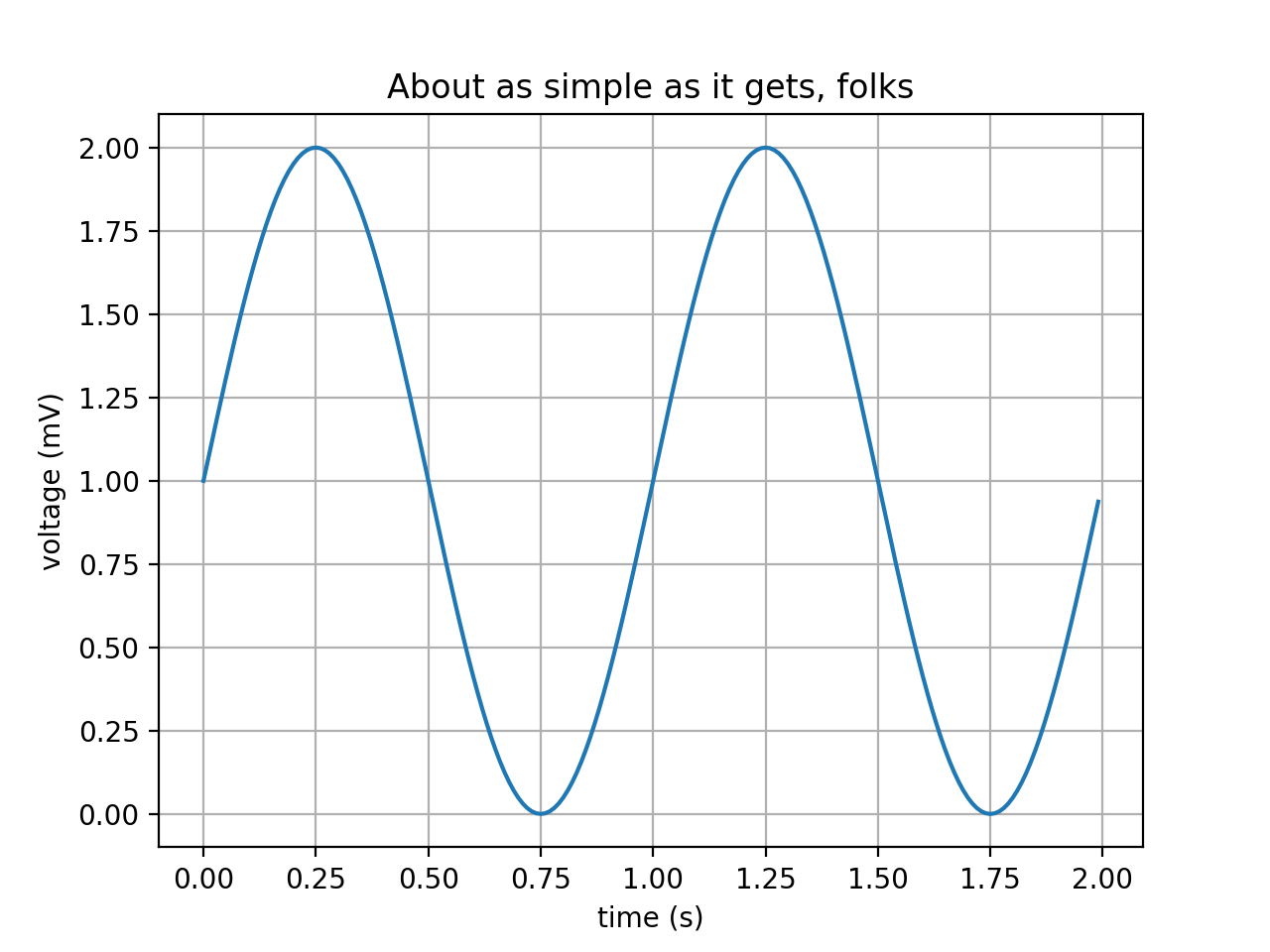
\(V(t) = 1 + sin(2\pi t)\)
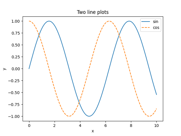
Multiple Line Plots
Subplots
3D Surface and Wireframe Plots
Plotting Guidelines#
Always label axes
Always include units where applicable
Legends only used with multiple datasets
Consider what it looks like in black and white
Include a title or a caption, but never both
Titles/captions should give more information than is already provided by the rest of the plot
Each plot should tell a self-contained story
Information from rest of the document should not be required reading to understand a plot
Consider splitting very busy plots or combining several simple plots if they are related
Example
Bad Plot
Better Plot
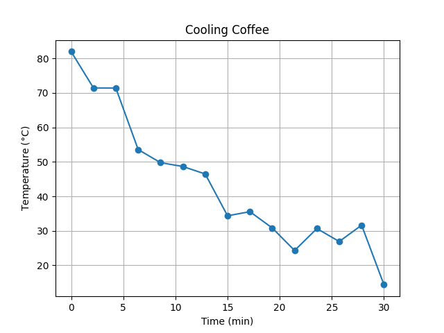
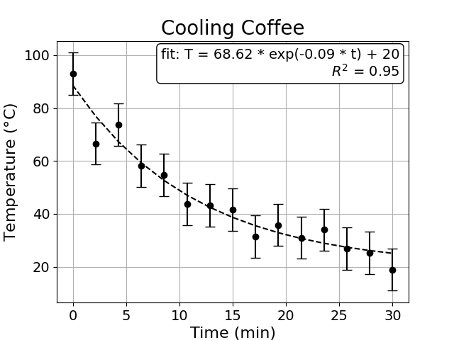
Experimental data is NEVER connected with lines (just use markers)
Lines are used for mathematical functions or trend lines (curve fits)
Use error bars when available
Pay attention to font size
If it looks good on the computer screen it’s good for written reports
Increase the font size a few points for presentations
Example
Bad Plot
Better Plot
Matplotlib Plotting Interfaces#
Matplotlib provides two interfaces for plotting: matlab-style and object-oriented interfaces
A Matlab-style interface
Uses the
pyplotsub-module to create plotsThis interface imitates Matlab plotting – the original goal of matplotlib
Works with an active figure that is modified as needed across different function calls until the figure is either closed or a new figure is explicitly created
The object-oriented interface
Uses the
Axesobject for plottingNo notion of an active figure
Provides better control over the figure
Pyplot Interface: Example#
# backend for rendering the plots, replace widget with inline if you do not see the plot in the output
%matplotlib widget

import numpy as np
import matplotlib.pyplot as plt

# Data to be plotted
x = np.linspace(-2,2,20)
y = x**2

# Create a new figure and plot
fig = plt.figure()
plt.plot(x, y, linestyle='solid', color='k', label='$x^2$')
plt.plot(x, 2 + np.sin(x), color='b', marker='o', label='$2 + sin(x)$')

# Decorate
plt.xlabel('x')
plt.ylabel('y')
plt.title('Pyplot Interface')
plt.xlim(-2.2, 2.2)
plt.ylim(-0.2, 4.2)

# Add legend
plt.legend()

# Show/save figure - optional
plt.savefig("pyplot_simple.png")
plt.show()
---------------------------------------------------------------------------
ModuleNotFoundError                       Traceback (most recent call last)
Cell In[1], line 2
      1 # backend for rendering the plots, replace widget with inline if you do not see the plot in the output
----> 2 get_ipython().run_line_magic('matplotlib', 'widget')
      4 import numpy as np
      5 import matplotlib.pyplot as plt

File /opt/hostedtoolcache/Python/3.11.9/x64/lib/python3.11/site-packages/IPython/core/interactiveshell.py:2480, in InteractiveShell.run_line_magic(self, magic_name, line, _stack_depth)
   2478     kwargs['local_ns'] = self.get_local_scope(stack_depth)
   2479 with self.builtin_trap:
-> 2480     result = fn(*args, **kwargs)
   2482 # The code below prevents the output from being displayed
   2483 # when using magics with decorator @output_can_be_silenced
   2484 # when the last Python token in the expression is a ';'.
   2485 if getattr(fn, magic.MAGIC_OUTPUT_CAN_BE_SILENCED, False):

File /opt/hostedtoolcache/Python/3.11.9/x64/lib/python3.11/site-packages/IPython/core/magics/pylab.py:103, in PylabMagics.matplotlib(self, line)
     98     print(
     99         "Available matplotlib backends: %s"
    100         % _list_matplotlib_backends_and_gui_loops()
    101     )
    102 else:
--> 103     gui, backend = self.shell.enable_matplotlib(args.gui.lower() if isinstance(args.gui, str) else args.gui)
    104     self._show_matplotlib_backend(args.gui, backend)

File /opt/hostedtoolcache/Python/3.11.9/x64/lib/python3.11/site-packages/IPython/core/interactiveshell.py:3665, in InteractiveShell.enable_matplotlib(self, gui)
   3662     import matplotlib_inline.backend_inline
   3664 from IPython.core import pylabtools as pt
-> 3665 gui, backend = pt.find_gui_and_backend(gui, self.pylab_gui_select)
   3667 if gui != None:
   3668     # If we have our first gui selection, store it
   3669     if self.pylab_gui_select is None:

File /opt/hostedtoolcache/Python/3.11.9/x64/lib/python3.11/site-packages/IPython/core/pylabtools.py:338, in find_gui_and_backend(gui, gui_select)
    321 def find_gui_and_backend(gui=None, gui_select=None):
    322     """Given a gui string return the gui and mpl backend.
    323
    324     Parameters
   (...)
    335     'WXAgg','Qt4Agg','module://matplotlib_inline.backend_inline','agg').
    336     """
--> 338     import matplotlib
    340     if _matplotlib_manages_backends():
    341         backend_registry = matplotlib.backends.registry.backend_registry

ModuleNotFoundError: No module named 'matplotlib'
Object Oriented Interface: Example#
#import numpy as np
#import matplotlib.pyplot as plt

# Data to be plotted
x = np.linspace(-2,2,20)
y = x**2

# Plot
fig, ax = plt.subplots(1, 1)
ax.plot(x, y, linestyle='solid', color='k', label='$x^2$')
ax.plot(x, 2 + np.sin(x), color='b', marker='o', label='$2 + sin(x)$')

# Decorate
ax.set_xlabel('x')
ax.set_ylabel('y')
ax.set_title('OO Interface')
ax.set_xlim(-2.2, 2.2)
ax.set_ylim(-0.2, 4.2)

# Alternate method for decoration
#ax.set(xlabel='x', ylabel='y', title='OO Interface', xlim=(-2.2, 2.2), ylim=(-0.2, 4.2))

# Add legend
ax.legend()

# Show/save figure - optional
fig.savefig("OO_simple.png")
Plot Parameters#
The
plotfunction inpyplotand theplotmethod of theAxesobject are used to plot data of the form \(y = f(x)\)
Both take in optional formatting parameters of color, marker, and linestyle
If not specified, these will be automatically determined
These parameters can be combined into a single string to specify the plot formatting
| color | marker | linestyle | |||||||||||||||||||||||||||||||||||||||||||||||||||||
|---|---|---|---|---|---|---|---|---|---|---|---|---|---|---|---|---|---|---|---|---|---|---|---|---|---|---|---|---|---|---|---|---|---|---|---|---|---|---|---|---|---|---|---|---|---|---|---|---|---|---|---|---|---|---|---|
|
|
|
These parameters can be combined into a single string to specify the plot formatting
x = np.linspace(-2, 2, 20)
fig = plt.figure()
plt.plot(x,     x, '-g') # solid green
plt.plot(x, x + 1, '--c') # dashed cyan
plt.plot(x, x + 2, '-.k') # dashdot black
plt.plot(x, x + 3, ':r') # dotted red

plt.show()
Subplots with Pyplot Interface#
#data to be plotted
x = np.linspace(0, 10, 50)

# Create an empty figure, all arguments are optional
# figsize is the figure size in inches
plt.figure(figsize = (8,8))

# Add a plot to the left, upper left corner
# Assumes there are going to be 2 rows and 2 columns
plt.subplot(2, 2, 1)
plt.plot(x, -1 + 0.2*x, '-r')

plt.subplot(2,2,2)
plt.plot(x, -1 + 0.02*x**2, '--gs', markersize=4)

plt.subplot(2,2,3)
plt.plot(x, np.cos(x), '-.b')

plt.subplot(2,2,4)
plt.plot(x, np.sin(x), ':k')

plt.show()
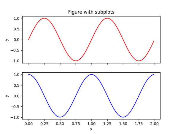
Subplots with Object-Oriented Interface#
# x values to be plotted
x = np.linspace(0, 10, 40)

# First create a grid of plots
# axs will be an array of 2D ndarray of Axes objects
fig, axs = plt.subplots(2, 2, sharex=True, sharey=True)

# Call plot() method on the appropriate axes object
axs[0, 0].plot(x, -1 + 0.2*x, '-r')
axs[0, 1].plot(x, -1 + 0.02*x**2, '--gs', markersize=4)
axs[1, 0].plot(x, np.cos(x), '-.b')
axs[1, 1].plot(x, np.cos(x), ':k');

# Set figure size
fig.set_size_inches(8, 8)
#fig.savefig("OO_subplots.png")
Annotations#
# Create some data
x = [1, 2, 3, 4, 5]
y = [10, 15, 13, 17, 20]

# Create scatter plot
fig, ax = plt.subplots()
ax.scatter(x, y)

# Add annotations
for i, txt in enumerate(y):
    ax.annotate(txt, (x[i]+0.05, y[i]+0.5))

plt.show()
# Create some data
x = np.linspace(0, 2*np.pi, 100)
y_sin = np.sin(x)
y_cos = np.cos(x)

# Plot sin(x) and cos(x)
fig = plt.figure()
plt.plot(x, y_sin, label='sin(x)')
plt.plot(x, y_cos, label='cos(x)')

# Add arrows and function labels
plt.annotate('sin(x)', xy=(np.pi/2, 1), xytext=(np.pi/2, .6), arrowprops=dict(facecolor='black', arrowstyle='->'))
plt.annotate('cos(x)', xy=(np.pi, -1), xytext=(np.pi, -0.7), arrowprops=dict(facecolor='black', arrowstyle='->'))

# Set axis labels
plt.xlabel('x')
plt.ylabel('y')

plt.show()
Text Boxes#
# Create some data
x = np.linspace(0,5,20)
y = -2*x**2 + 5*x + 10

# Create line plot
fig = plt.figure()
plt.plot(x, y)

# Add text box
textstr = f'Max value: {max(y):0.2f}'
props = dict(boxstyle='round', facecolor='wheat', alpha=0.5)
plt.text(0.5, -10, textstr, fontsize=14, bbox=props)
plt.grid(True)

plt.show()
Interactive Plots#
from ipywidgets import HBox, FloatSlider
plt.ioff()
plt.clf()
slider = FloatSlider(orientation='vertical', value=1.0, min=0.02, max=2.0)

fig, ax = plt.subplots()
x = np.linspace(0, 20, 500)
lines = ax.plot(x, np.sin(slider.value*x))
def update_lines(change):
    lines[0].set_data(x, np.sin(change.new * x))
    fig.canvas.draw()
    fig.canvas.flush_events()
slider.observe(update_lines, names='value')
HBox([slider, fig.canvas])